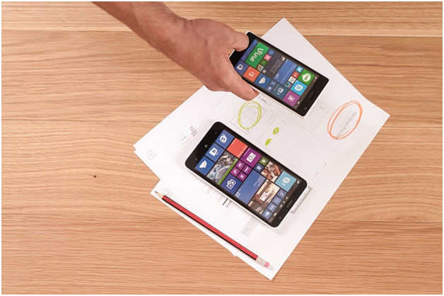
Designing a webpage, a website and even a web marketing campaign used to be about designing for desktop. That’s how most potential customers would access a site, so it made perfect sense. As more and more people began accessing the web via mobile devices, different design considerations came into play. Now, mobile web access has caught up with – and in some countries, overtaken – desktop access. It’s time to make sure that your site is designed to make the most of this trend, and to design for mobile before you design for the desktop.
Different focus
Sites designed primarily for desktop access can be problematic on mobile devices. They can load slowly, be difficult to navigate, and fiddly to use. People don’t want to be squinting at a screen designed for desktop when they’re looking for the nearest restaurant, shop or activity. It’s no longer good enough to be able to access your site via a mobile device – the design of the site has to be optimised for mobile usage.
Simplify, simplify, simplify
Most smartphones can zoom, but not everyone is using a smartphone. It helps to use single columns for text and to keep your layout as simple as you can. The same goes for your CTAs. It can be fiddly entering lots of text on a smartphone, so keep any forms to a minimum and make them big enough to be easy to use. For more design tips, see https://www.webcredible.com/blog/7-usability-guidelines-websites-mobile-devices/.
Be responsive
A good web designer, like http://www.rycomarketing.co.uk/web-design.html, who offer web design in Belfast, will design a responsive site – one that will change according to the device that is being used to access it. It’s still important to design for mobile first, however, because a simple web page looks good on a big screen – a complex one looks horrible on a small screen.
Focus on content
Because the screen of a mobile device is so much smaller than a desktop screen, you can’t have enormous amounts of information on a page. This is actually an advantage, as it means that you have to focus on content when designing your site. There is no room for irrelevant or redundant information, and no space for extra images. Everything has to be focused and straight to the point.


Leave a Reply