The so-called “Blue Screenshot of Death” has been terrorizing the hearts of Windows users since time immemorial. Well, specifically from Windows 95. Before there were other blue screens for various minor errors and functions, but none like the one that since then began to warn us of the serious errors of the operating system.
The final design of this screenshot is due to Raymond Chen, one of Microsoft’s veteran developers, and his team. There are some recurrent confusions about the history of this screen, like the false myth that Steve Ballmer wrote it, and that’s why today we are going to tell his story to clarify who did what.
What Ballmer did write was the first screen of Ctrl + Alt + Del(Control, Alt and Delete), which coincidentally was also shown in blue in its first versions, like other error screens before it. Therefore, let’s start by marking the differences between other blue screens and the blue screen of death.
From ‘Ctrl + Alt + Del’ to ‘Blue Screen of Death’
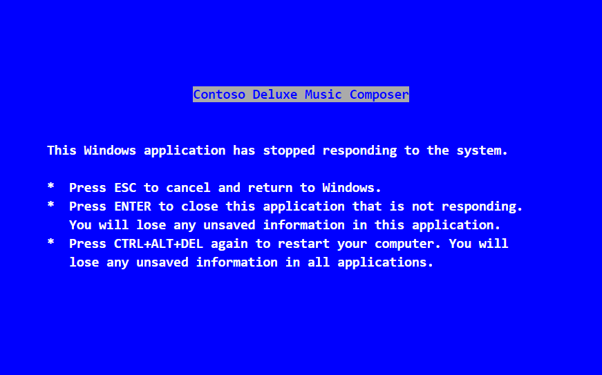
No, it is not true that Steve Ballmer wrote the “Blue Screen of Death”, also called BSoD for being an abbreviation of Blue Screen of Death. It does not matter that the media worldwide write that it was in September 2014, because that attribution is due to a failure in the interpretation of an article by Raymond Chen.
What Ballmer wrote was the text of the dialogue that appeared, also in blue, when pressing the Ctrl + Alt + Delete keys. This key combination was introduced in Windows 3.1, and it was used to determine if the system was responding or if it had been blocked, and identified which application was faulty for this malfunction.
According to Raymond Chen, when they showed Ballmer this new feature he was satisfied with it, but he did not like the text he had too much. The developers told him that if he had any better ideas they were open to proposals, and the manager ended up writing the final text.
The screen told you that there was an error because an application had stopped responding, and it gave you the possibility to stop the responsible application, restart the computer or cancel. Yes, that could be canceled the screenshot is a clue that was not very death. In addition, from Windows 95 the format of this screen was changed, and it stopped showing in color “blue-death” to be seen as another window within Windows.
In those times of MS-DOS and Windows 3.1 there were also other screenshots that were shown in the same color. Some were so innocent that they only informed you that you should put a floppy disk in the PC, and others were just saying that two programs wanted to use the same port, and I was asking you if you wanted to let the last one try to take control.
What there was not in Windows 3.1 was a screen for serious system failures. If an application failed, a blue screen would appear advising you, but Windows continued to work. But if it was the driver or driver of a device that caused a fatal system failure in Windows 3.1, the entire virtual machine would shut down and you would simply go back to MS-DOS.
There was therefore no message to warn you of these fatal errors in the kernel, so in Windows 95 they designed one. And it is this screen that ended up being called the “Blue Screen of Death”. A myth was born, the real nightmare for millions of users.
The evolution of the screen of Death
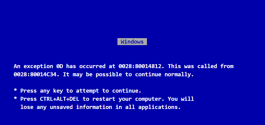
Therefore it was in Windows 95 when they began to show messages warning of fatal system errors. As the developer Raymond Chen explains in his article ‘I wrote the blue screen of the original death’, his team was the one who designed these messages, and he who modified his text to give them his first definitive form .
He was responsible for the code that showed the screens . This code asked the video driver in kernel mode to switch to text mode, to fill the screen with a blue background with a blank text. Then, this fatal error program waits for the user to press a key, tries to restore the screen to its original content and informs the component that requested the message of the user’s response.
You may also like to read: MacOS Sierra: How to install it and what are its main innovations?
Explained in a more understandable way, Windows 95 tried to stay on its feet despite the kernel level failure. In his first verifications of fact, the blue screen message was optimistic, since it told you that it may be possible to continue with what you were doing. If you pressed any button Windows would try to continue, and if you pressed Ctrl + Alt + Delete it would restart.
From a technical point of view, the administrator of the virtual machine abandoned an event currently in progress and returned to the event distributor. If there were no events in progress, the blue window closed the application and you’re done. But sometimes the problem was global, and when the event was abandoned or the application was closed the problem was not solved, and the next events or applications that you started in Windows would launch again and again the screenshot.
Since originally this message did not show information about which elements failed, Chen modified it to include the name of the driver that fails , its section number and its displacement within the section. For our eyes, these were just random numbers, but thanks to that the Microsoft team could know where the problem was, which line of the code caused the error, and try to repair it and then launch an update with the solution.
Later the error message was continued changing to add a little more code to inspect the address of the errors and if it was inside the kernel manager. In addition, in this new change the mythical phrase “It may be possible to continue with normality” was eliminated , because in the end it was almost never possible to continue.
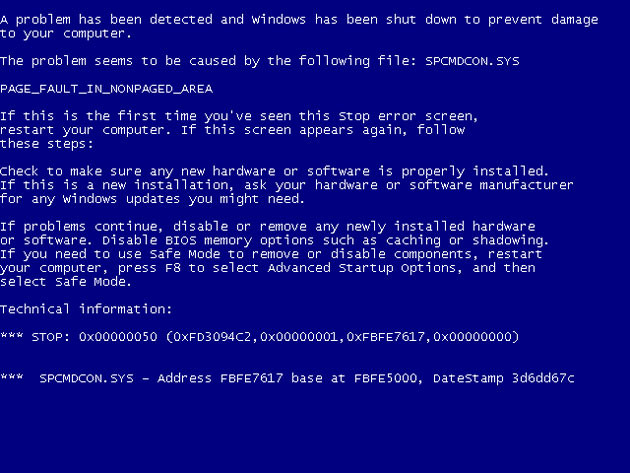
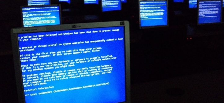
Later in Windows XP the screenshot continued to evolve to show even more information and include more explanations to try not to alarm users. But once again, the attempt to calm down with the message had the opposite effect, since it is difficult not to panic when the screen turns blue and you see a huge text telling you strange things.
This screen also explained that if the problem persisted you could try entering the safe Windows mode to remove or disable components before restarting again. In fact it also explained how to enter the safe mode by pressing F8 when starting the system, but by the time they reached that part of the text many users had already panicked. After all, it is the “Blue Screen of Death”.
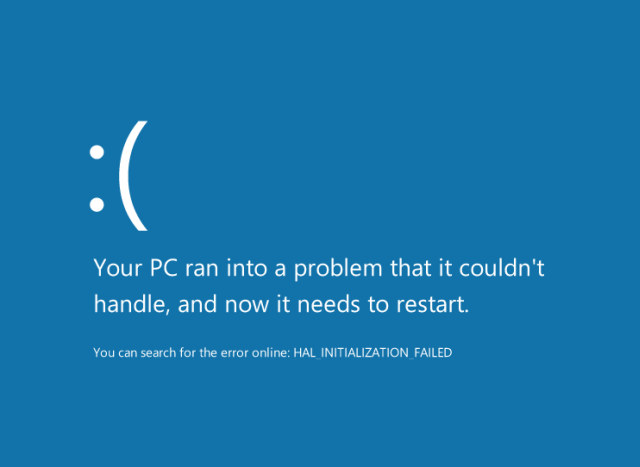
Windows 8 arrived, and with it Microsoft decided to stop intimidating users with large texts and simplify this screen. In this system, the screen was limited to saying that our PC had a problem that it could not handle and that it needed to be restarted, and it put a sad emoticon. No more explanations were needed, by then everyone already knew what that screen meant: Death.
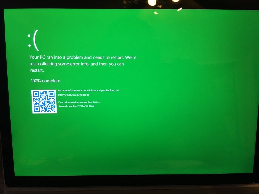
To not be so simple, in Windows 10 Microsoft added a QR code in the screenshot, and even after they dared to change the color to a green one. In fact, in this last screen, they tell you directly that as soon as they collect the necessary information about the error, you can restart the computer.
As you can see, the official blue screen according to the Windows developers themselves is one that warns of fatal errors in the operating system. Therefore we can not count as screenshots of death many others of that color that was before Windows 95, including the “Control + Alt + Delete” of Windows 3.1.
Its history has left us thousands of shocking moments in the least anticipated places, and surely we still have a few more. Although to tell the truth, the number of these screenshots has decreased considerably in Windows 10. It is not so exciting anymore.
Tags: blue screen of the death, Windows


Leave a Reply